










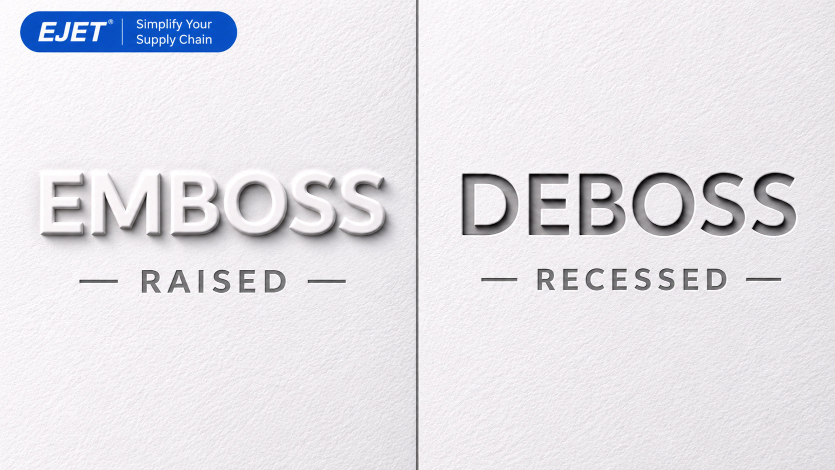
Embossing raises a design above a material’s surface, while debossing presses it below the surface. Choose embossing when you want a raised focal point; consider debossing when you prefer an inset mark.
This comparison explains how embossing vs debossing affects appearance, material selection, logo design, and production decisions.
What is the difference between embossing and debossing?
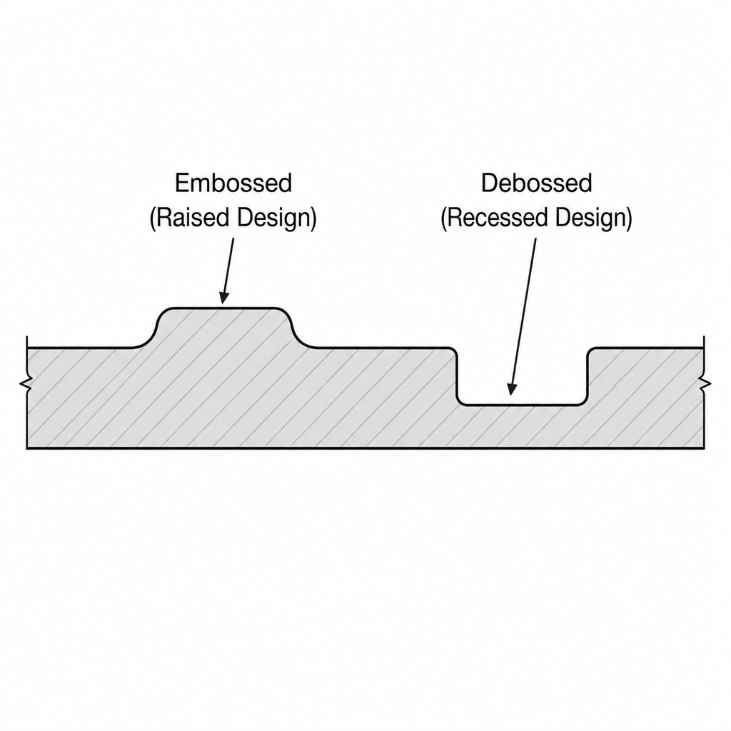
The essential difference is direction: an embossed design projects outward, while a debossed design sits inward. Both reshape the material rather than simply adding a printed image. On paper, dies and controlled pressure create the relief, often with heat to help form the sheet. Neither process inherently requires ink or foil.
|
Comparison criterion |
Embossing |
Debossing |
|---|---|---|
|
Surface position |
Raised above the surrounding material |
Recessed below the surrounding material |
|
Tactile effect |
A projecting shape you can trace |
An indentation you can follow |
|
Visual effect |
Raised edges catch light and cast shadows |
Recessed edges create shadow within the design |
|
Color requirement |
Can stand alone without ink or foil |
Can stand alone without ink or foil |
|
Decorative options |
Can align with print or foil |
Can align with print or foil |
|
Design direction to explore |
A dimensional focal point |
An inset, understated mark |
Both finishes offer different ways to create dimension; neither is automatically more sophisticated. Die shape, depth, and edge profile also influence the finished appearance. Treat the final row as a creative starting point, then compare physical samples rather than choosing from terminology alone.
How the processes create texture
For paper embossing, the sheet sits between a shaped die and a matching counter-die. As the press closes, these tools mold the material into the intended relief. Debossing reverses the direction of that relief so the selected image moves below the face of the sheet. The tooling must suit both the artwork and the stock.
Depth is a specification to discuss, not a setting to maximize. The available effect depends on paper thickness, the intended design, and the die. A modest impression can still provide useful dimension, so ask the printer to recommend a depth that supports the artwork rather than requesting the deepest possible finish.
The phrase textured printing covers more than these two methods. For example, thermography creates raised print using heated resin powder, whereas embossing changes the paper’s shape. When requesting quotes, specify a raised or recessed impression in the material; asking only for “raised printing” can describe a different production process.
Which is better for your logo: embossing or debossing?
For an emboss vs deboss logo decision, start with whether the mark should project outward or sit within the surface. Embossing is worth exploring for a raised emblem, seal, or monogram. Debossing is worth exploring for inset lettering or branding. Both are used for logos, so the better choice depends on your intended presentation and the material.
Use the following as a design-review checklist rather than a rule about what each method can achieve:
|
Logo decision |
Embossing direction |
Debossing direction |
|---|---|---|
|
Desired first impression |
Explore a mark that stands above its background |
Explore a mark that feels pressed into its background |
|
Role within the layout |
Test the logo as the main dimensional feature |
Test the logo as a quieter supporting feature |
|
Color treatment |
Compare blind relief with printed or foiled relief |
Compare blind recesses with printed or foiled recesses |
|
Approval priority |
Check the raised outline and internal spaces |
Check the recessed outline and internal spaces |
Whichever direction you choose, review the logo at its actual production size. Fine lines, tiny lettering, and tightly packed details deserve particular attention; artwork may need heavier strokes or more space to reproduce clearly. Keep the original brand artwork intact and approve a separate finishing version with the printer.
For your design review, place the proposed mark within the whole layout. Decide whether texture should carry the branding or simply reinforce a printed name. This keeps the finishing choice tied to a clear communication goal instead of making dimension the goal itself.
Paper, board, and reverse-side considerations
Paper selection is part of the design decision, not an afterthought. Suitable text and cover papers have the strength needed for embossing, while a textured stock can create contrast against areas smoothed by the impression. Ask to see finished examples on your proposed stock or a closely comparable paper before committing.
Do not assume that a heavier-looking sheet will accept every design. Thin papers and some coated stocks can be less forgiving under pressure. Both embossing and debossing need a material that can hold the intended shape without unacceptable damage, so include the exact stock in the production discussion.
|
Material issue |
Embossing |
Debossing |
|---|---|---|
|
Stock suitability |
Confirm that the paper can form and retain raised detail |
Confirm that the paper can accept the intended recess |
|
Reverse-side effect |
A single-sheet impression can leave a corresponding recess |
A single-sheet impression can leave a corresponding bump |
|
Two-sided artwork |
Review the reverse layout before production |
Review the reverse layout before production |
|
Clean-back requirement |
Discuss construction options with the printer |
Discuss sufficient thickness or duplex construction |
A clean reverse is a specification, not a guarantee attached to the word “deboss.” Print Peppermint identifies stock thickness and duplex construction as considerations when impressions must not show through. If a business card has contact information on the back, request a sample showing both sides together.
Emboss vs deboss leather: which should you choose?
For leather, choose debossing when you want recessed initials or a pressed-in logo, and explore embossing when you want raised relief or an overall textured pattern. The up-versus-down distinction remains useful, but suppliers’ descriptions can overlap. Confirm the desired surface effect with a physical sample or close-up reference rather than relying on the word “embossed.”
|
Leather criterion |
Embossing |
Debossing |
|---|---|---|
|
Intended relief |
Raised design or textured surface |
Recessed design |
|
Application to explore |
Decorative grain, repeating texture, raised elements |
Initials, monograms, inset artwork |
|
Approval reference |
A sample showing the desired pattern and relief |
A sample showing the desired impression and depth |
|
Supplier instruction |
State which elements must stand above the surface |
State which elements must sit below the surface |
Leather embossing is not limited to isolated logos. Cortina Leathers, for example, produces embossed upholstery leather with decorative patterns, including geometric and animal-inspired textures. That makes it important to distinguish an overall surface treatment from a localized branding mark when preparing your brief.
Debossed leather can be blind or combined with foil. Leatherology describes blind debossing as an impression without added color or foil, which may match the leather or appear slightly darker from burnishing; its foil debossing adds a contrasting finish during stamping. Ask for the intended leather-and-finish combination, not just a photograph of similar lettering.
Engraving is a separate option. It removes material rather than forming a raised or recessed impression through pressure. If your reference shows an engraved mark, flag that difference before asking a supplier to reproduce it through embossing or debossing.
Blind finishes, print, and foil
“Blind” describes an impression that stands alone rather than aligning with printed ink or foil. A registered emboss aligns the relief with another image, while a combination emboss incorporates foil with the dimensional treatment. These choices let you separate two decisions: the direction of the relief and whether it needs additional visual contrast.
|
Finish approach |
Embossing |
Debossing |
|---|---|---|
|
Blind |
Raised detail without added ink or foil |
Recessed detail without added ink or foil |
|
Registered to print |
Raised shape aligned with printed artwork |
Recessed shape aligned with printed artwork |
|
Combined with foil |
Foil emphasizes the raised design |
Foil emphasizes the recessed design |
Both processes can accompany printing and foil stamping. For your sample review, compare a blind version with a contrasting version if visibility is an important part of the brief. Choose the one that serves the intended layout, rather than assuming that adding another finish will necessarily improve it.
Cost and production trade-offs
There is no useful universal price winner in a deboss vs emboss comparison. Die complexity matters: single-level tooling can be relatively economical, while multilevel and sculptured dies introduce more elaborate work. A fair comparison needs the same artwork, stock, quantity, and finishing requirements for each option.
Use this checklist to request comparable quotations:
- Tooling: Ask which die type each proposal includes and whether the design uses one level or several.
- Material: Specify the same stock or leather, including any required construction.
- Finished appearance: State whether each version is blind, printed, or foiled.
- Proofing: Ask what physical sample is included and how revisions are handled.
- Delivery: Request a schedule covering artwork approval, tooling, proofing, and production.
- Repeat orders: Ask whether tooling can be retained and what a repeat quote would include.
Treat these as questions for your supplier, not assumptions about standard pricing. If budget is tight, request a simpler single-level alternative alongside the preferred design. Domtar’s guidance recommends working with the printer to identify the most cost-effective way to achieve the intended effect.
Prepare artwork and approve a physical sample
Good embossed designs begin with clear production instructions. Before adapting the artwork, ask the printer for its file requirements, minimum line weights, spacing guidance, and restrictions near trims or folds. Supply finishing elements separately from ordinary printed artwork, following that provider’s specifications rather than treating another printer’s minimums as universal.
Use this approval sequence for either finish:
- Define the relief. Identify exactly which elements rise or recess, using an annotated reference if necessary.
- Review detail. Check small type, narrow strokes, and gaps; discuss simplification before making the die.
- Specify the material. Confirm the actual stock and intended construction, including the reverse side.
- Explain complex levels. Provide a clear level map or reference for sculptured artwork.
- Approve a physical impression. Examine the result on the specified material before authorizing the full run.
During approval, compare the sample against your original brief. Check the outline, internal spaces, reverse side, and any alignment with ink or foil. Record the accepted material and finish so the approved sample becomes a shared reference rather than relying on a verbal description.
Make the choice around the finished piece
Use the emboss vs deboss distinction as your starting point: raised relief versus recessed relief. Then make the decision around the actual application. A logo, a two-sided card, and an all-over leather texture require different conversations, even when they share the same finishing terminology.
Choose embossing to explore raised dimension; choose debossing to explore inset detail. Take your artwork, intended material, quantity, and reverse-side requirements to a print or leather-finishing specialist. Request a comparable quote and a physical sample before committing—the right result is the one that delivers your intended effect on the finished piece.